
Typographic Poster Series
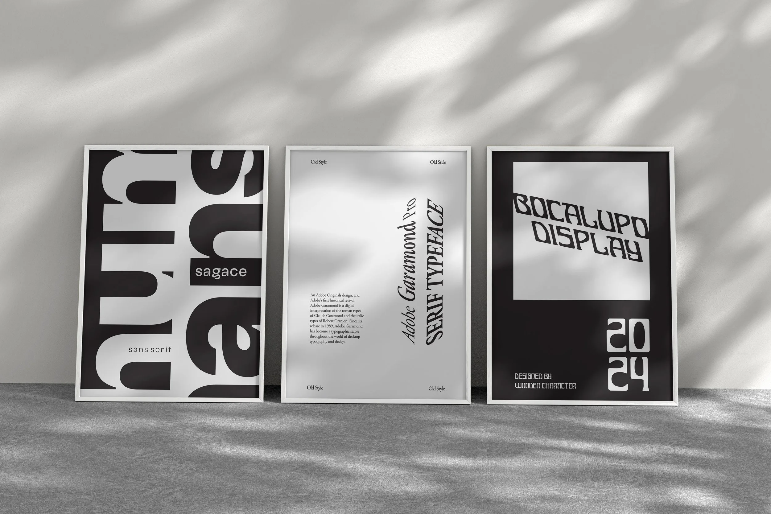
Objective / Brief: In this project, the goal is to explore how a type classification can communicate mood and personality through careful letterform selection, repetition, and spatial decision-making. By limiting the tools and working only with typography, the focus will be on form, rhythm, and composition rather than decoration. Create a series of three posters, each with their own unique typeface, classification, and mood.
Creative Solution: For this project, I was able to achieve my goal of creating distinctive moods through the use of typography. This project required intentional, focused design, leaning heavily into the core principles of design as only one element of design as a tool (typography). In the first poster I used a sans-serif grotesque font to create a clean and modern feeling, which is supported by my use of negative space. In the second poster I worked with Adobe Garamond Pro, which is a modern rendition of the Garamond, an old style serif font. The mood communicated through my design is classic and traditional with the layout of the composition. To make this work stand out, I used perspective to add visual weight to the title, which adds a modern theme to the work, breathing new life into the old style font. The final poster is built on Bucalupo, a unique display font. For this poster I wanted to convey boldness, which was achieved through my use of negative space. Also supporting this mood was my use of contrast, drawing the visual attention of the viewer to the title.